Project
Overview
Project Overview
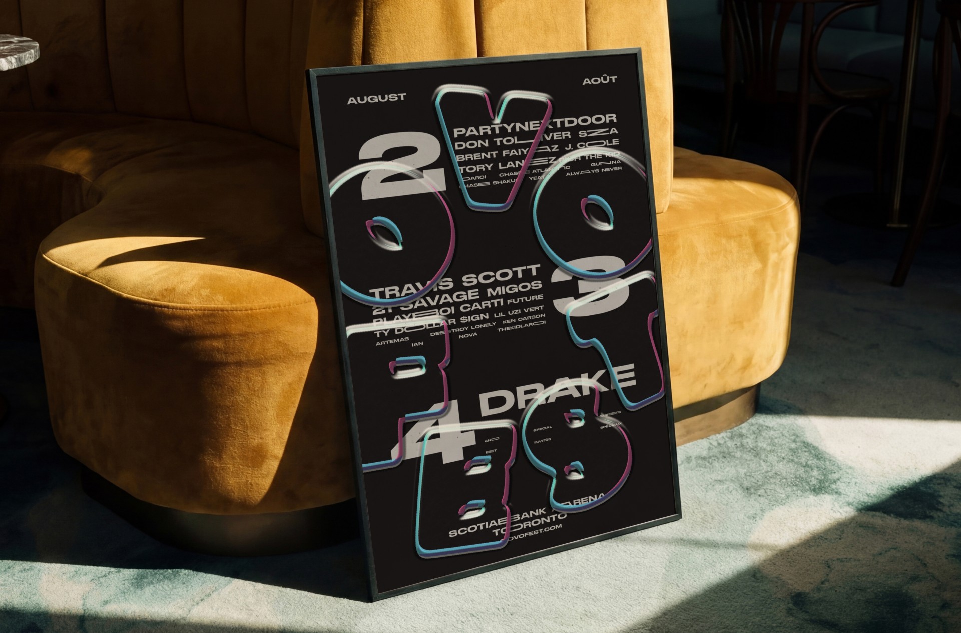
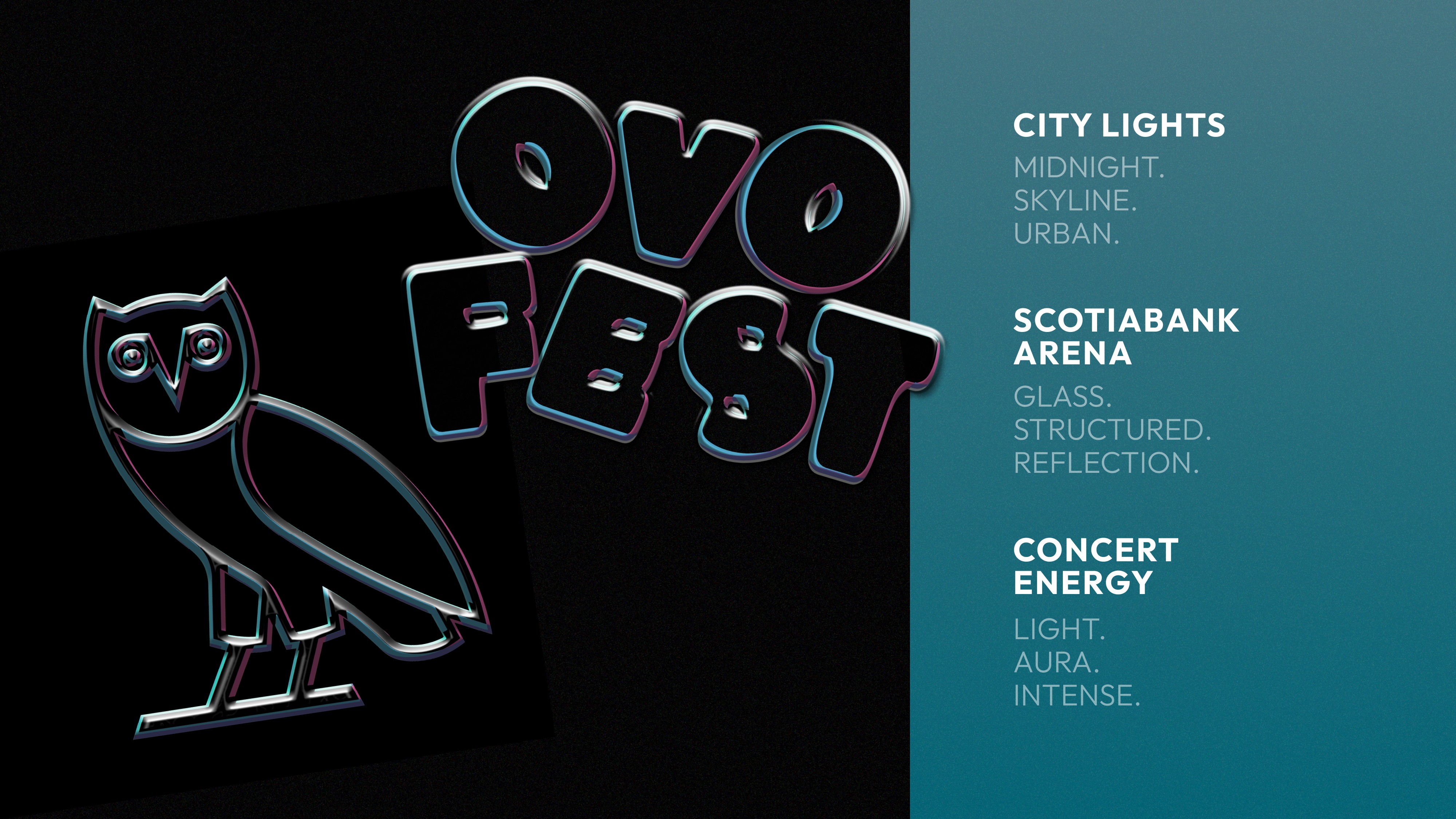
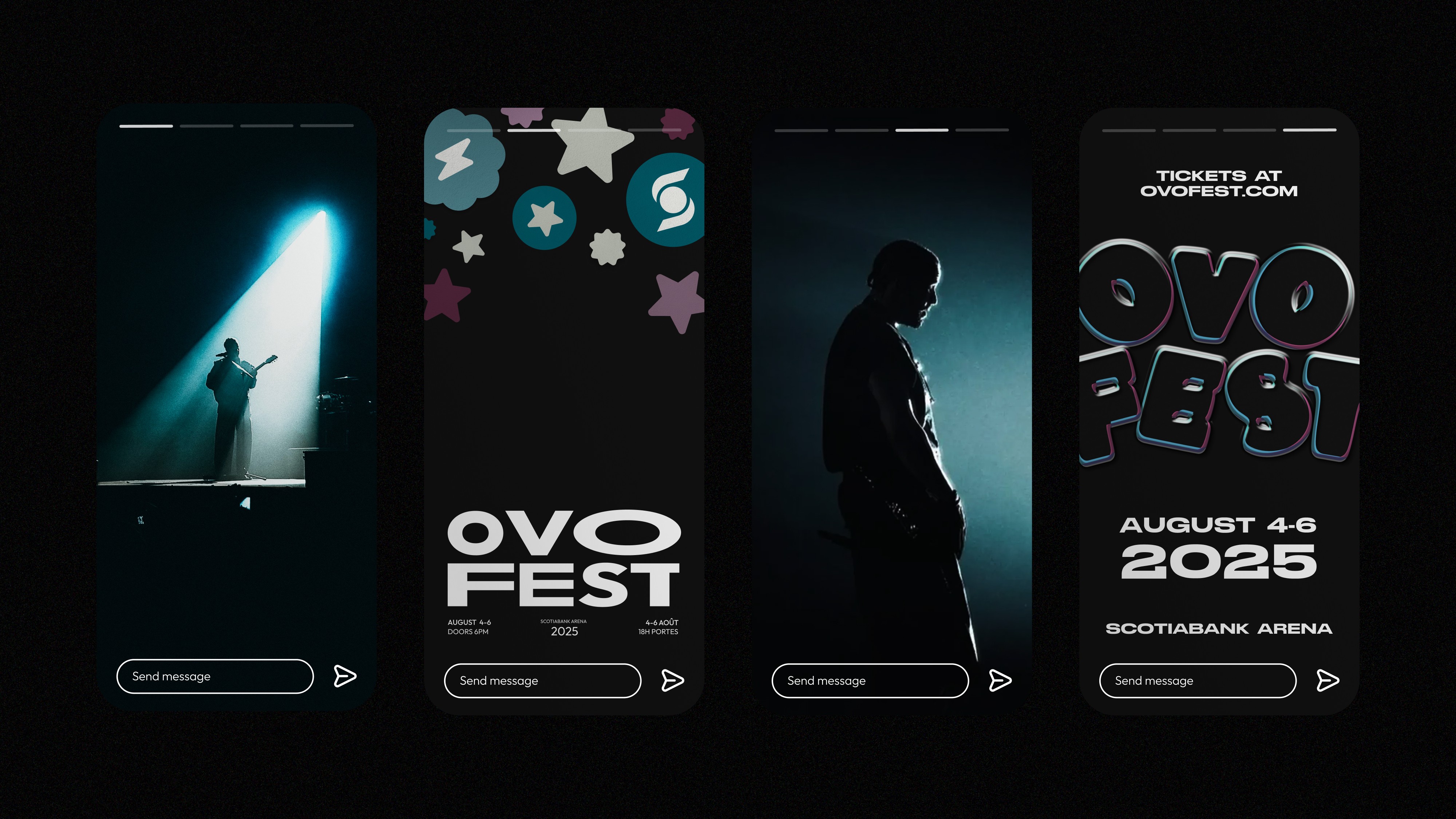
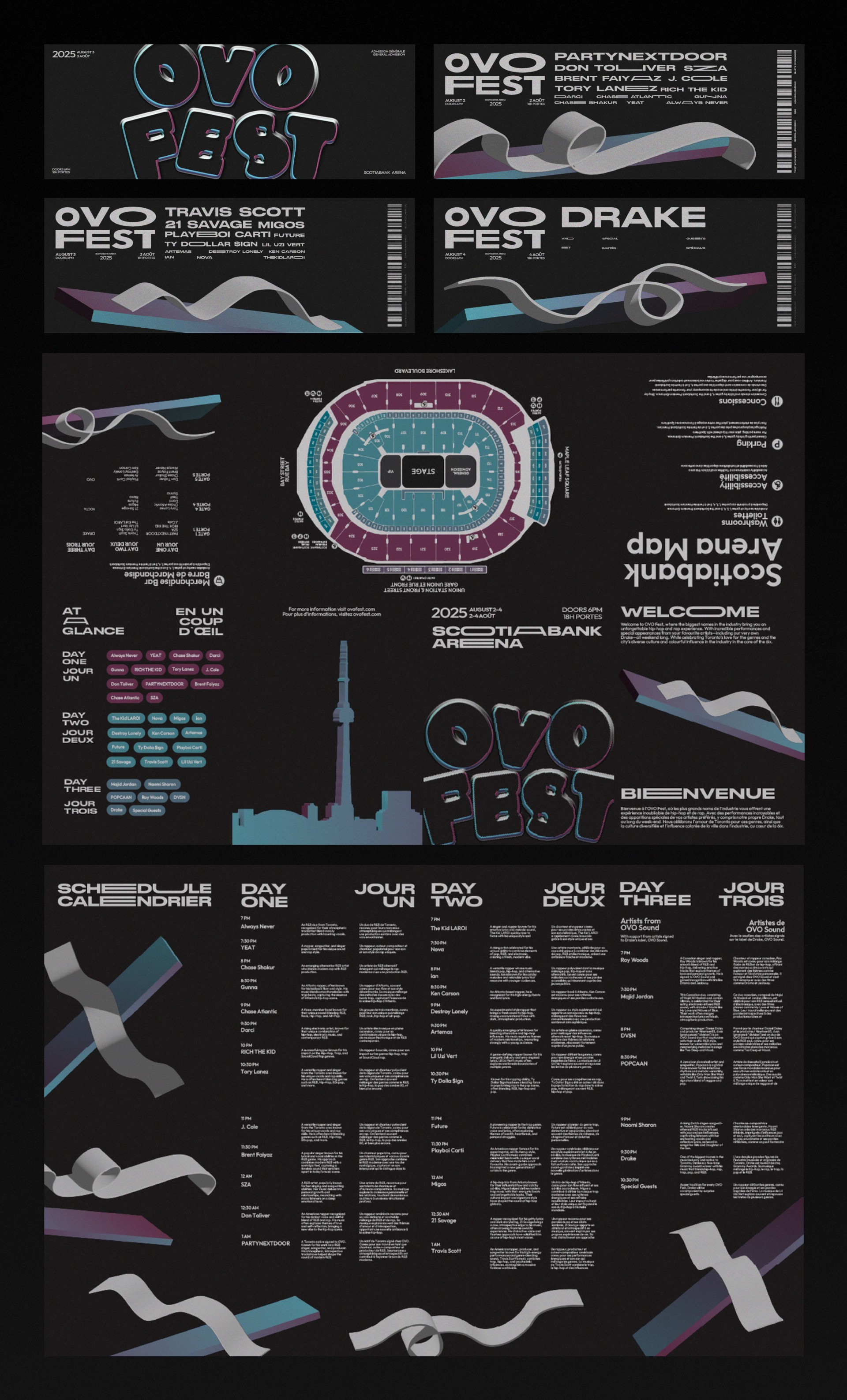
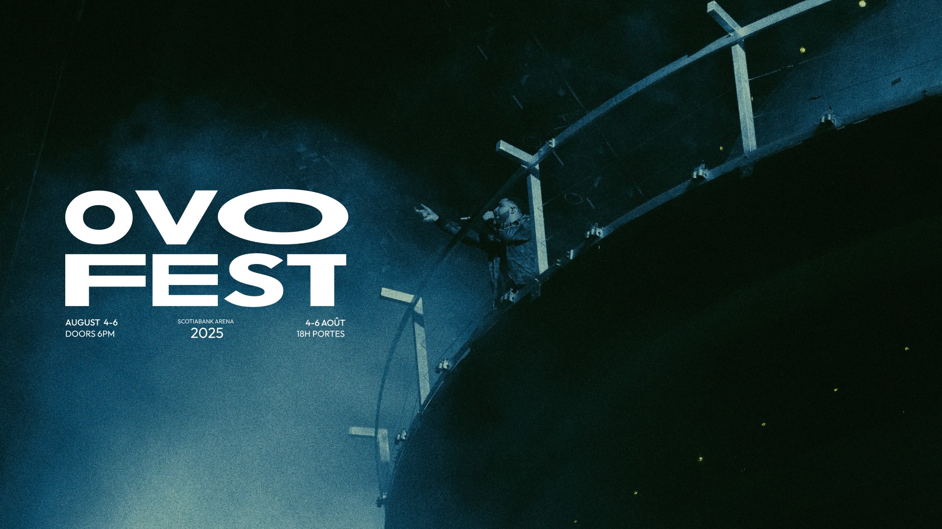
OVO Fest is a three-day festival celebrating Toronto’s music and cultural scene under the iconic Drake’s October’s Very Own. This project features a cohesive system that blends bold, modern aesthetics with practical applications. Incorporating 3D effects, glass-like typography, and dynamic layouts to deliver a high-energy, forward-thinking visual language.
OVO Fest is a three-day festival celebrating Toronto’s music and cultural scene under the iconic Drake’s October’s Very Own. This project features a cohesive system that blends bold, modern aesthetics with practical applications. Incorporating 3D effects, glass-like typography, and dynamic layouts to deliver a high-energy, forward-thinking visual language.
Industry
Entertainment & Media (B2C)
Entertainment & Media (B2C)
Timeline
September — December 2024 (12 Weeks)
September — December 2024 (12 Weeks)
Tools
Adobe Creative Suite (Illustrator, InDesign, Photoshop, After Effects), Figma
Adobe Creative Suite (Illustrator, InDesign, Photoshop, After Effects), Figma
Adobe Creative Suite (Illustrator, InDesign, Photoshop,
After Effects), Figma
Scope
Branding, Visual Identity Systems, Bilingual Adaptation, Conceptual Brand Applications, Motion language, Multi-format Design Implementation
Product Design, Branding, Visual Identity Systems, System Design, Site Mapping, User Flow, User Research, Conceptual Brand Applications, Motion Design,
Multi-format Design Implementation, Data Visualization.
Product Design, Branding, Visual Identity Systems, System Design, Site Mapping, User Flow, User Research, Conceptual Brand Applications, Motion Design, Multi-format Design Implementation, Data Visualization.
Problem
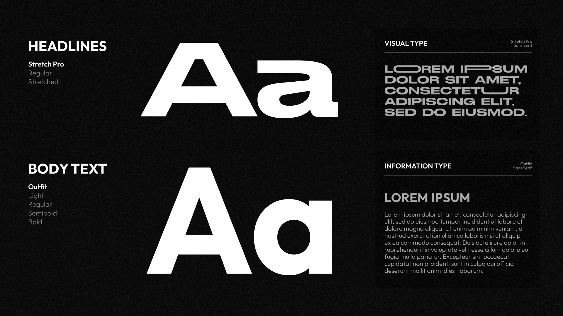
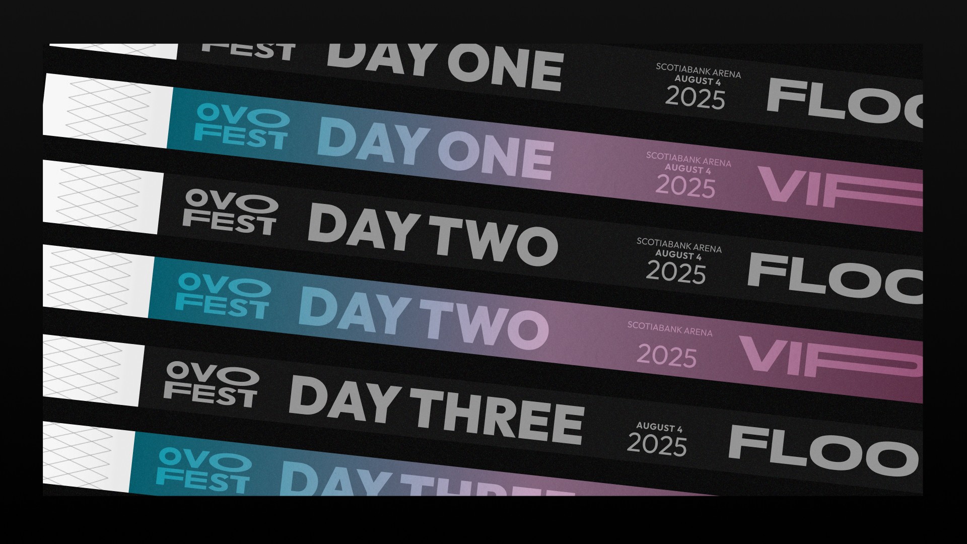
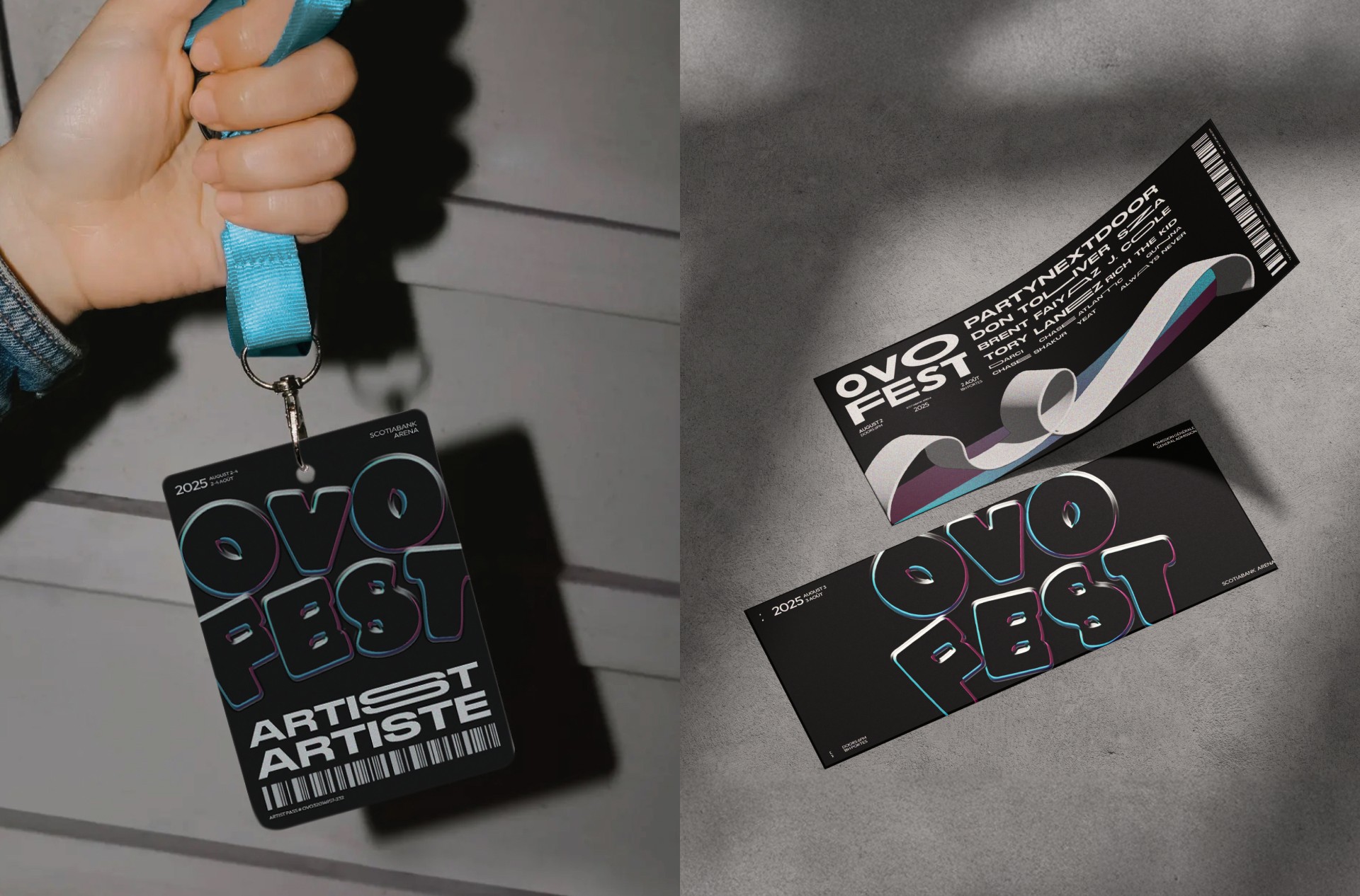
The main challenge was creating a visual identity that could be both bold and versatile. Typography needed to carry personality and energy, rather than just communicate information, while all assets had to function across print, digital, and motion formats. I also had to ensure that programs, tickets, and passes were clear, accessible, and aligned with the festival’s high-impact brand, all while experimenting with layouts, textures, and type to push the creative direction.
The main challenge was creating a visual identity that could be both bold and versatile. Typography needed to carry personality and energy, rather than just communicate information, while all assets had to function across print, digital, and motion formats. I also had to ensure that programs, tickets, and passes were clear, accessible, and aligned with the festival’s high-impact brand, all while experimenting with layouts, textures, and type to push the creative direction.
Solution
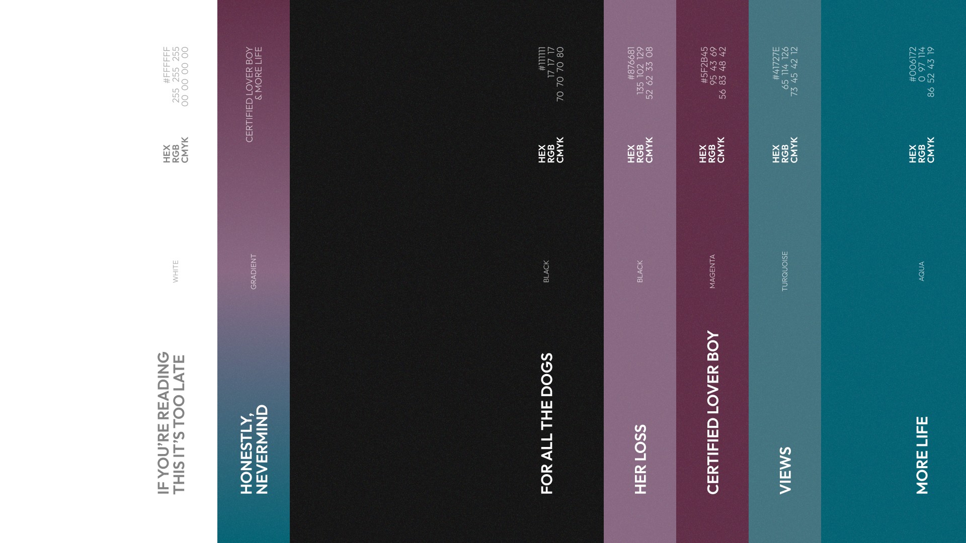
All layouts had to accommodate both English and French simultaneously on the same surface, specifically for printed and tangible formats like tickets, passes, and programs. Since French text typically runs 15–30% longer than English, any layout locked to a fixed text width could break, meaning layouts needed to remain visually balanced and legible in both languages without compromising hierarchy or brand impact.
All layouts had to accommodate both English and French simultaneously on the same surface, specifically for printed and tangible formats like tickets, passes, and programs. Since French text typically runs 15–30% longer than English, any layout locked to a fixed text width could break, meaning layouts needed to remain visually balanced and legible in both languages without compromising hierarchy or brand impact.
All layouts had to accommodate both English and French simultaneously on the same surface, specifically for printed and tangible formats like tickets, passes, and programs. Since French text typically runs 15–30% longer than English, any layout locked to a fixed text width could break, meaning layouts needed to remain visually balanced and legible in both languages without compromising hierarchy or brand impact.